How My Design Intervention Reduced Friction in the User Journey
Patients struggled to confidently choose a doctor, leading to repeated comparisons and a significant drop-off before booking.

About this Cross-Functional Collaboration
Year: 2025
Duration: 14 working days
Role: solo end-to-end product designer
The Team: 2 front-end developers, 2 back-end developers, 1 technical engineer lead 1 product manager, 1 user researcher, 1 product design lead, 1 product designer
Online Consultations Were the Company’s Second-Largest Revenue Source
| Context |
Dr. Saina is a telehealth or an online health service app with two main services at a time: home blood test, and online medical consultation. In this project, I worked in a cross-functional team to improve part of the online consultation journey where users should select their preferred doctor out of a listing of doctors.
Patients couldn’t confidently decide which online doctor to choose
| Problem |
Doctor cards lacked the trust and comparison information users needed, leading them to move between the listing and doctor profiles four times on average. This repeated back-and-forth increased hesitation and the risk of leaving before booking a consultation.
Friction in the listing page led to high drop-off rate in the funnel
| Why did it matter? |
For users: They couldn’t confidently choose a doctor they trusted, so many abandoned the booking journey. This frustrating experience could also reduce their willingness to return to the platform when they needed help again.
For business: There is a great amount of credit they lose from potential customers and also from users word of mouth on social media or in-person. Also, it costs the business to have a negative ROI.
To get on the same page with the product manager about the challenge, I needed to collect data
| How did I approach this challenge? |
During the data collection step, out of the user researcher finding and heatmap analysis, I noticed the lack of trust elements in doctor’s card in the listing.
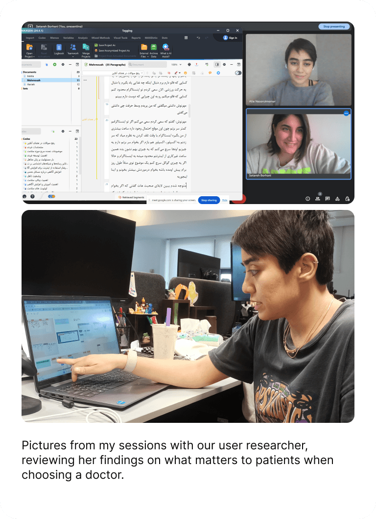
I wondered how we can help our users decide which doctor to choose between a list of doctors, which elements might help them to compare and decide.
The more users moved between the doctor listing and individual profiles to compare options, the more likely they were to abandon the booking journey altogether.


How Might I Help Users Choose a Doctor More Confidently and Reduce Drop-Off on the Listing Page?
| Design Challenge |
Out of data analysis, I figured out that the average back and forth from the listing page to the profile and then from profile to the listing page was around 4 times.
| Data Backup |
Users Need Trust Signals to Choose and Will Leave When They Can’t Find Them
| Insights |
Research from our UX researcher showed that patients relied heavily on other people’s experiences when choosing a doctor.
Testing the Cognitive-Load Hypothesis
| Findings |
Based on UX principles and my previous experience, I hypothesized that the amount and presentation of information were creating cognitive overload.
Back-up:
I reviewed session recordings, which showed signs of confusion and users overlooking content. I then ran guerrilla usability tests with several colleagues, and their behavior further supported the hypothesis.

What Could Help Users Decide?
| Solution Space |
Recent Descriptive User Reviews Added to The Doctor Card
Research showed that people relied heavily on other patients’ reviews when choosing a doctor.
I translated this digital form of word of mouth into user reviews on the doctor cards. Competitor analysis later showed that two similar platforms in the US and India were already using reviews in this way.

Turning Patient Reviews Into Trust-Building Element
In post-consultation surveys, patients repeatedly described doctors using similar qualities: the same way they might recommend a doctor to other users.

Challenge and My Approach
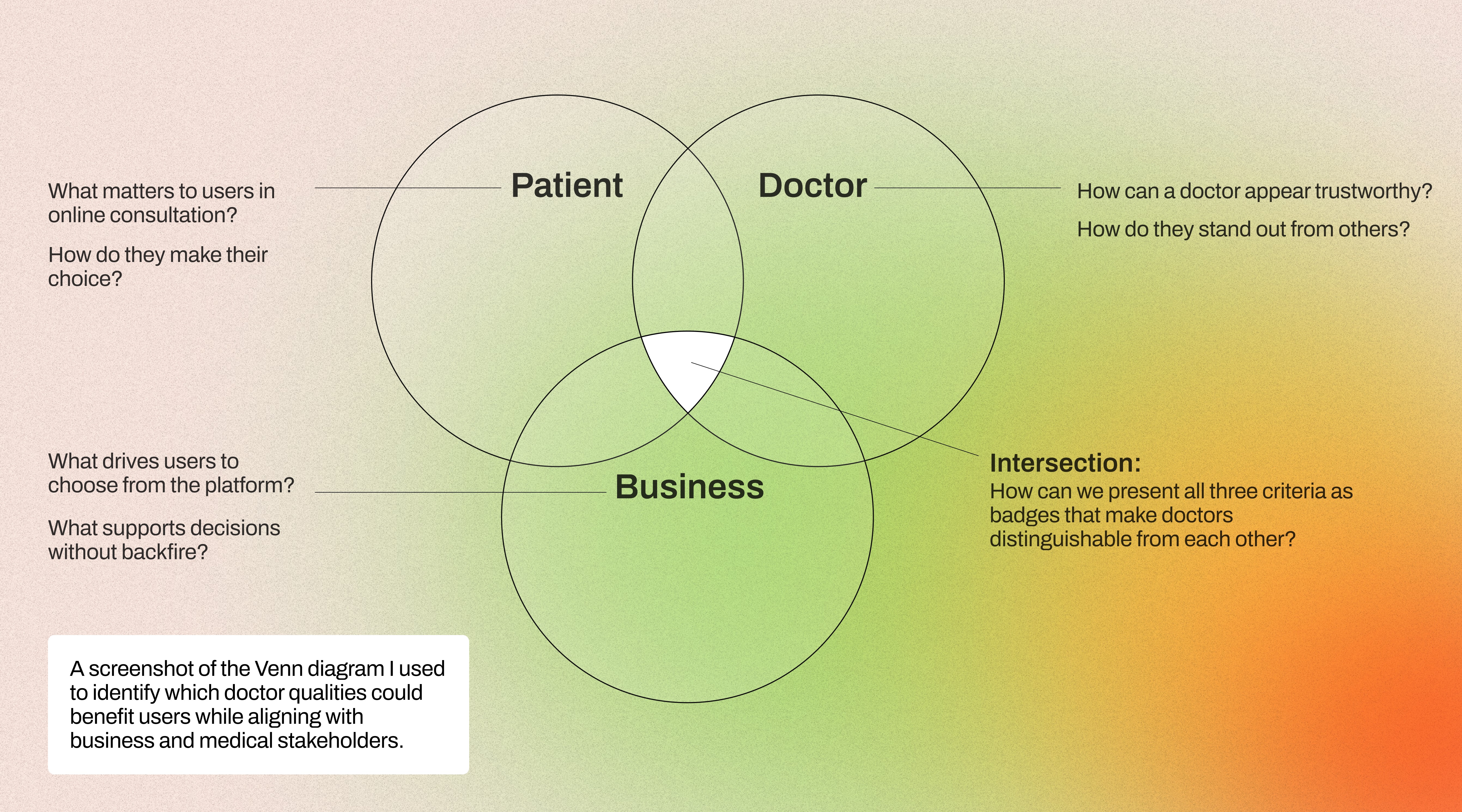
Which Badges Should Be Defined And Added to Doctor Card?
| Design Creativity |
Designing the badges meant balancing user language, medical credibility, and technical feasibility. Some qualities patients mentioned, such as accurate diagnosis, couldn’t be responsibly verified, while others weren’t supported by our data or technical setup.
Final Three Badges
Recommended by patients
Derived from post-visit satisfaction scores. Most frequently mentioned trust signal by users choosing a doctor.
Trusted by patients
Based on high revisit rate within a defined timeframe. Signals continuity of care and long-term confidence.
Experienced on the platform
Threshold: consultations exceeding a set limit on the platform. Differentiates doctors with a proven track record.
Wireframes Prepared Before Phasing Changes Decide

Too Many Changes at Once Could Spoil Our Work
| Design Strategy |
After sharing my solutions with the product manager, we came to this decision that it is better to put changes into three phases:
Adding trust elements, including reviews and badges
Removing information that was unnecessary, confusing, or could be shown later in the consultation journey
Making doctors easier to compare without repeatedly opening their profiles
Phase#1
Drop-Off Rate=-4.5%
| Goal: Reduce cognitive load, Establish trust signals |
Badges added
Rating made more meaningful &
Extra contents were cleaned up

Phase#2
Drop-Off Rate=-8%
| Goal: Support decision-making with reviews |
Up to 3 recent patient reviews added

Phase#3
Drop-Off Rate=-5%
| Goal: Reduce visual complexity for less tech-savvy users |
Icon-type labels replaced with “available” label


P.S. I made this video showcasing the doctor card interactions with Figma Make.
Decisions We Made For Card Design in Three Phases
Reviews Built Trust
Users paused to read and expand patient reviews, confirming their importance in choosing a doctor. So, we kept them in the final card.
Easier to Scan, Easier to Choose
Removing unnecessary information and adding badges made the cards easier to scan and compare. Users preferred doctors with badges, especially those with two.
Back-and-forth: 3 → 2 times
Drop-off: 35% → 16%
What I Learned
01 Validate Feasibility Early
Involving technical stakeholders early saves time and helps me design within real constraints.
02 Small Changes Can Have Meaningful Impact
Not every problem needs a big redesign. Sometimes a few thoughtful changes can make the experience much better.
03 Balance Ideals With Constraints
Good design is also about knowing what is possible and finding the best improvement within those boundaries.